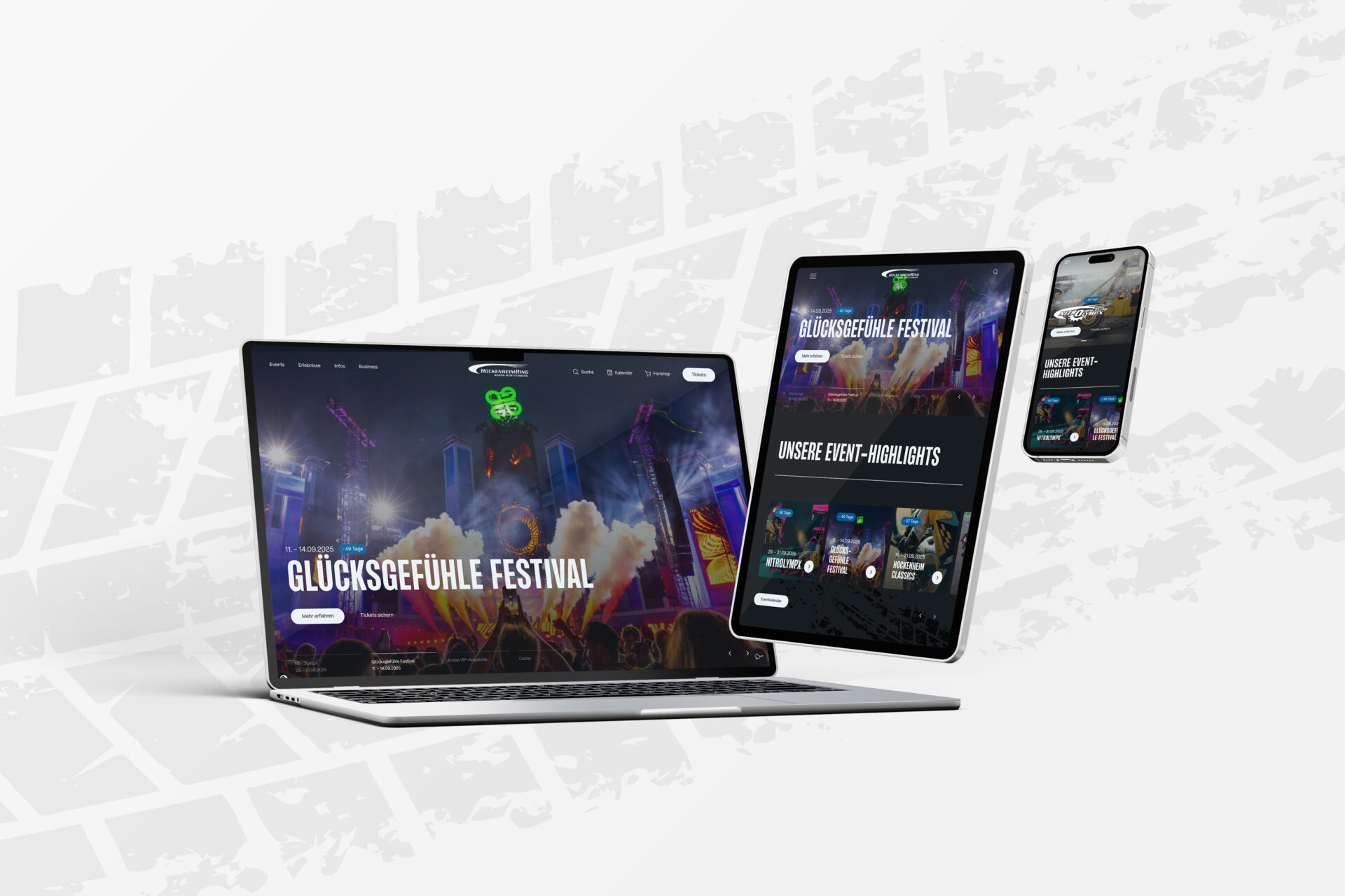
A fresh look for hockenheimring.de – new design, better structure
The Hockenheimring stands for speed, adrenaline – and now also for a new digital user experience. The website of the traditional race track has been given a comprehensive facelift: technically well thought-out, visually refreshed, functionally optimised. The aim of the innovations is to improve user guidance and functionality without abandoning the existing technical basis.
The basis for the new concept was a detailed UX/UI analysis, i.e. an evaluation of the user experience and user interface.
Navigation is at the heart of the optimisation. This has been conceptually and visually redeveloped with the clear aim of making it much easier to find your way around and at the same time strengthening the visual line of the site.
Functional improvements have also been made in key areas: the event calendar has been given an improved filter function for more targeted use. A new quick navigation in the app style supplements the user interface with a fixed entry point to important areas such as directions, tickets, FAQ or contact.
In addition to these functional improvements, work has also been carried out on the visual design: The content modules have been modernised, giving the entire website a uniform and fresh appearance.
The circuit’s website is now tidier, more user-friendly and future-ready – welcome to www.hockenheimring.de!